My experiences in the world of fine art - from making my work, selling it, navigating and living within it to the people and work that inspires me.
Showing posts with label oil paint. Show all posts
Thursday, June 12, 2014
Friday, June 06, 2014
Stuff
So we have the mural sketched out- next week on Tuesday, the paint will show up, and then week after- it'll be done. I'll be documenting the process and will post a time lapse on my youtube... I forgot to record us projecting and sketching but it wasn't the cool part anyways. All the freehand junk will be recorded as long as I'm around to record it. I enjoy blogging but I also enjoy watching Youtube so I figured, YOU PROBABLY DO TOO :) I'll link it here, and all of my other accounts when I get there.
ONWARDS.
Been hacking away at some other stuff. Tried out a brunaille and a Verdaille, now I need to try grisaille.
Cute dog progress. (Brunaille, starting to add colour)
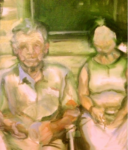
New portrait commission base coat- trying out Verdaille.
I really want to start varnishing my work, but it's almost all commission and I don't have time. I mean that's a good thing because I'm being a grown woman making money and stuff, so there's that.
Ciao!
-C.
Sunday, May 25, 2014
Secret Murals- SHHHH!
I Can't say too much, but I have some exciting events coming up. In terms of the information I can give you, I can tell you it's part of the Beautification of Surrey project, and I'll be planning and making it with my fellow artists Hailey Logan, Shandis Harrison, Andres Salaz and Jess Orrin. I'll be keeping a play-by-play of the progress and when it's finished, perhaps I can show you how we went through the proposal process.
I'm very excited for this opportunity and wish I could show everyone our preliminary sketches- they came together so quickly, and I would say as a team we work incredibly well!
As for images, I can show you NOTHING, haha. But here's some updates on old things, moving slow but getting close (ahhh, glazing...)
Thursday, May 15, 2014
Short Blurb
I really like how this looks in black and white.... I've done so many layers on this thing and yet for some reason in colour it looks unfinished. So here's the edited version, which I prefer because it's harder to tell that there are so many muddy colours; only contrasted by the chalky blue background. But without colour, I would pass it as near finished.
Here's to crossed eyes.
Saturday, May 03, 2014
Nothing is Easy
As a gift to my friend Manuel, who modelled for me a few months ago, I decided to give him a small portrait. Considering the ease of the last one, I really thought it would be quick...
No.
Nada.
...oh it looks a bit like-
-NOPE.
Just goes to show you it isn't WHAT or WHO you're painting, but the abstract shape, colour, form and tone within it. Always try to flatten the image- take away all meaning, twist it upside down if that helps you. Make it so you don't recognize it. Never paint 'Manuel'- just paint colour.
Good luck.
Thursday, March 27, 2014
Manganese Blue Hue
My favourite colour, to paint with right now, is Manganese Blue Hue.
Mmmmmm, juicy.
I happened upon this colour in a Gamblin starter set, and I suppose it's based on some old, toxic colour that disappeared for awhile. I had the same experience with my beloved Flake White (which used to be full of lead) and now I'm starting to think I am attracted to things which could potentially kill me one day.
The reason I am posting about some colour, is that people seem to comment most on the coloration of my works.
I've always gravitated towards certain types of work with a juicy type of luminescence. I feel that pastels have a glow. All of my under paintings are done in a pale colour, very thinly, and I like to work up into the darks. I like to do this because I'm interested in the transparency of the layers of oil paint.
Without any technical understanding of colour theory, I began by looking at my favourite colourists and wondering how they worked. One artist who inspired me deeply was Mark Ryden, who isolated himself with white during the Snow Yak Show and used only bits of very pale colour.
I believe this lead him into his signature tonal style, which has shone through his work since. When I first saw his work, it was still beautiful enough to capture me, and as a preteen I obsessed over a CD cover he'd designed for Jack Off Jill- but I would say the Snow Yak Show was a discipline based exercise that created some of his best work.
For that reason, I am isolating myself (as a colourist). I have been for awhile, and I think it's working. I haven't forced myself into the same paleness as Mark Ryden, but I'm sacrificing things... I only really let myself pick a few colours and white. Right now my paintings are about the red family- a consistent mix of oranges, reds, and pinks that remind me of the sugary Kool-Aid I drank as a kid. Then there's white- and when I get to really important parts, I use Manganese Blue Hue.
Angels singing, trumpets and stuff!
It's like magic. Wherever I place it, colour comes to life. When I mix it, I notice things I didn't notice before. It's the secret ingredient in an Italian grandmother's recipe (it's more Garlic). I am madly in love with a colour, but I know it's only sheer luck. I know if I use it too much it'll become tasteless like a favourite food- eaten too often.
It will be fleeting, I know my love will disappear one day if I ever leave this family of colours... But for now, it's a fresh new romance.
If my boyfriend reads this, I still love you, but can you be my Manganese Blue Hue?
Sincerely,
C.
Labels:
Art,
artist,
color,
color theory,
colour,
complimentary color,
Gamblin,
long yak,
manganese,
manganese blue,
Manganese blue hue,
mark ryden,
oil,
oil paint,
painting,
pastel,
snow yak,
snow yak show
Subscribe to:
Posts (Atom)